Tuesday 25 January 2011

oh my....more photos from the .<....CUBEOPEN. 2010....>


Fancy little chairs. I like this idea of taking un-expected materials and turning them into a representation of useable object.


Adam Heiss: 'Underground series.'
'Subway tunnel are like another world which exists underneath everday reality.'


Blackpool is a grim place, it seems to have fallen down from its once high stature in British society. Having visited Blackpool quite a lot since birth, this work really connected to my own ideas about Blackpool and how it seems to be clinging on whilst the drunks and penis hat wearing 'stag-du' men try to pull it away. The images capture the fading bold colour and the now high unemployment rates and low tourism in Blackpool.


The work above attracted my attention because it is similar to my use of lines and colour,yet it seems to be based on the contours of land and locations.The 2 other blue 2d works also use 'parrallel walls,interlocking cylinders and repetitive forms. Somewhere between the pen,paper surface and hand,the story takes place,' in this representation of 'an architecture waiting to take place.'


Emily speed: Egg- nest- home-country-universe.
This work is described as miniature architecture, a 'hybrid form of incubator/shelters,' with the aim of this work being to convey how architecture affects the shaping of our identities. The title of the work was inspired by, 'The Hunchback of Notredame,' which i did not expect. I LOVED this work with a passion,the use of such delicate little eggs and architectural elements was quite humorous but conveyed a message to me of the idea of home and what home means and how themes such as architecture can be interpreted in interesting ways.


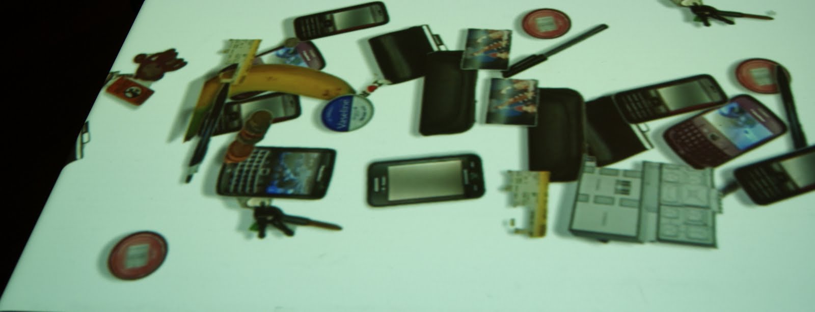
These models are so tiny and intricate yet they communicate so much which i found intriguing. I interpreted this work as small representations a derelict areas,in which piles of discarded broken pieces of objects can be found in piles. I think this work is by Carly Fischer,whose work focuses on the gentrification of contemporary urban space and the reproduction of an aesthetic. Fisher explores the fetishisation of junk,the piles become design objects.'


Sunday 23 January 2011

Foetus projection


I projected this film onto a giant hanging sculpture/installation.My inspiration being ' The Matrix,' (1999) and the idea of grown humans in a futuristic distopia.It all sounds very deep but i was simply interested in how to create an interesting audience expirience that would be remebered.I created this piece last year but i would like to create something similar this year, maybe something furry.

Friday 14 January 2011

CORNERHOUSE exhibitions Jan - March: People your not and Carey Young:Memento Park.

14//01//2011

http://www.cornerhouse.org/art/browse-year.aspx?year=2011

Manchester Art Gallery:RECORDERS. rafael lozano-hemmer


14//01//2011

<>

Rafael Lozano-Hemmers' 'Recorders,' has run since 18th september - 31st January at Manchester Art Gallery. The exhibition is geared towards audience participation,an audience of all ages and artistis/political/general knowlege can understand and enjoy this exhibition.I was thoroughly entertained and intrigued by the work,which put the I in Interactive art (i know that is slightly cheesy,but true.) Every aspect of the exhibition,such as the information and titles for each work,the lighting and layout is all geared towards the idea of surveillance and technology.


CUBEopen Exhibition Nov 2010-Jan 2011

Elizabeth West: 'Red trolley,yellow trolley,blue trolley.'(2009)
Shan Hur : 'Forgotten No 2,'2010.
Lee cambell: ' Red alert.'2010


Julia Munz and Annika Unterburg: 'Mobile architecture Model.'2008.
On entering the exhibition,i wasn't sure what to expect,it had been a fair few months (a year) since i had even ventured into the 'Cube' gallery,yet i was pleasantly surprised.It seems to me that people misunderstand the gallery as architecture obsessed when it is less concerned by this really and many of my best ideas have been conjured through seeing their exhibitions. The photographs above are a collection of installation based works that caught my attention. In particular the HARD HATS. The hard hat work by Munz and Annika used audience participation,humour but also a clear message of taking an architectural models and bringing in the 'conventions of the public realm' to convey the idea of 'possible and impossible future developments.' I also enjoyed the Shan Hur piece, i'm not sure on the artists' gender so please pardon the 'she/he' use.The work consisted of a vase encapsulated in the gallery wall. At first I wanted to know was how the artists had got away with smashing a massive hole in the wall, then i read the artists' statement. She/he explains how since being a child,'through my right eye i have been experiencing a very strange phenomenon,there have always been spots in my visual field.' I love anything like this, odd little individualities that make us all unique. She/He continues to say that the spots always seemed like some kind of map to hidden treasure,hence the vase in the wall. I just think that this work is so random yet completely rational and simple. It has forced me to think about how we all view life differently and colours,textures may look and feel different to a section of society.
Lee cambell and Liz West explored commercialism and used collection of similar objects to convey their point. Cambell uses a mass of 'buy one get one free' stickers. When my eyes fell upon these,i felt a sense of elation and excitement,this is what i feel when i see these stickers. My reaction made me realise the power that commercial industries have over the public. The work seems to grow like a poison out of the wall,whilst Liz Wests' work simply sits in the supermarket, a collection of items of the same colour. Her statement reads,' the work objects are often densely arranged in orders in compact spaces to form intensely coloured installations,video and photographic works displayed in architectural spaces,shops,markets and museums.' In the work displayed in the exhibition, West used the inetense collections of colour to highlight our how colour may look in mass in such a colourful environment as the supermarket were we seem to be attacked by colour and were colour is so highly constructed to affect what we buy.


My photography


These are just a few of my latest snaps for your browsing.

Monday 10 January 2011

JEAN Pierre JEUNEt

IMDB info: Jean-Pierre Jeunet
Director | Writer | Producer
surreal,fantasy yet dark and satirical:one of my favourite directors who greatly inspires my work across all media,

--------------------------------------------------------------------------------

Jean-Pierre Jeunet is a self-taught director who was very quickly interested by cinema, with a predilection for a fantastic cinema where form is as important as the subject. Thus he started directing TV commercials and video clips (such as Julien Clerc in 1984). At the same time he met designer/drawer Marc Caro with whom he made two short animation movies: L'évasion and Le manège
'Delicatessen,'(1991,)'The city of lost children'(1995) and obviously ''Amelie,'
(2001) his most well known film,each explore themes of identity and question how we process the world around us.He creates these fantastical worlds were anything seems possible but also manages to tell very human stories.

On the GQ film webisite,Jeunet is interviewed about his latest film 'Micmacs,'(2009)and mainly ,as quoted,'Jean-Pierre Jeunet on tackling real-life monsters (weapons manufacturers), his mixed critical reception in France and being ripped off by Hollywood.'


Sunday 9 January 2011

AHHHHHHHHHHHHHHHHHHHHH! i'm so excited

I've just stumbled,well...more like broken my leg tripping over this information:


Siobhan davies related performances in the whitworth across the road from me!!

'Siobhan Davies Dance presents ROTOR, an ensemble of performances, sound, installations and artworks which fills Siobhan Davies Studios. Following The Collection, presented last year at Victoria Miro Gallery and Ikon Eastside, Siobhan Davies further extends her connections with other disciplines and commissions nine artists to make, in their own art form, work based on ideas generated by dance and choreography.'

It doesn't surprise me that Davies is working within this mixed media context as she actually went to art school and dropped out to become a dancer,she also heavily involves art and film in her practise,her work is intrinsic to my practise as a dancer and i can't wait to go and see this as artists display their own interpretations of the work.


Times:
Thurs & Fri 6-9pm, Weds, Sat & Sun 1-4pm
Performances begin Thurs & Fri 6.20pm & 7.40pm, Weds, Sat & Sun 1.20pm & 2.40pm

Tickets:
free entry, no booking required

Location:
The Whitworth Art Gallery, Oxford Road, Manchester M15 6ER

Whitworth art gallery: Wallpaper 2


This repetition of images,whether screen printed or computer printed is not just visually interesting,the metaphorical meanings behind the use of repetition mentioned in the exhibition extract really makes sense and i had never thought about wallpaper in a subversive way before this exhibition. The work has inspired me to use some form of repetition in my illustration,expecially seeing as some of my favourite artists including the EPIC andy warhola used this method,the idea of how we consume images daily intrigues me.

Choreographer : AKRAM KHAN.


'Akram Khan is one of the most acclaimed choreographers of his generation working in Britain today. Born in London into a family of Bangladeshi origin, he began dancing at seven and studied with the renowned kathak dancer and teacher Sri Pratap Pawar.

He began presenting solo performances of his work in the 1990s, maintaining his commitment to classical kathak as well as developing modern work. In August 2000, he launched Akram Khan Dance Company with producer Farooq Chaudhry, which has provided him with a platform for innovation and a diverse range of work through collaboration with artists from other disciplines.'


DANCE DANCE DANCE

I just realised that i haven't posted any dance on here yet,it must be done. Heres one of my favourite choreographers. Matthew Bourne,i've seen a few of his works,two of these were live and he is currently touring his new hsow,'Cinderella.' Bourne is a contemporary dance choreographer,he mixes ballet with pedestrian movment,recognisable miming,humour and acting,far removed form traditional ballet.His work is inspiring in its' emotional content and set design,he often takes a recognised story and adds sinister,human truth that can be related to easily by the audience,using inspiration from iconic musicals,films,childhood memories and human insecurity.
CANNOT WAIT TO SEE THIS!!!!!

BRIAN HUBBLE : photo collage


This is another style of illustration tha i would like to experiment with;using photo transfering and screen printing to create Rauschenberg -esque images,as this would probably work more effectively for poster art.Hubbles' work is photo-collage illustrations created using screenprinting,lightboxes,photo transferring,scratching and the melting of images onto glass and canvas.I'm definatley going to experiment with some of these techniques,in particualr the lightbox.

'Brian Hubble is an American painter, illustrator and practitioner of anti-art happenings. He is best known for his Outsider Art approach with dark collage illustrations for such publications as the New York Times.'

Valero Doval


Velero Doval: another illustrator that i have discovered in'ILLUSTRATE NOW,'similar to Genova (previous post)uses animal heads on human bodies in one of his illustrations and explores surreal,satirical compositions. His style really connects with me,as this is a style similar to what i hope to achieve in some of my work: a mixture of surreal themes,collage,illustration and photography.In'ILLUSTRATION NOW,'Doval states that his work is ' a mix of illustration and collage filled with colour,wit and style,it's a combination of vintage imagery,nature and delicate handwork.' MEDIA: collage,pen,pencil,paper,computer.

nicholas di genova

'i document the flora and fauna that may or may not exist in this world,' using pen,ink and animation paint (?)I love this work!! I saw illustrations similar to this in the MMU foundation show last year but not on this scale of detail and as i am intereated in creating creatures and non-human beings in my drawings,this work provides me with ideas as to developing my visual style involving crteatures,as at the moment i am using plain background but i would like to fill the page with more detail. .. ..


Illustration inspiration: some pretty darn good work in this book ive got: Taschen illustration now 3.


I bought the 2nd edition of this book last year before i started my foundation diploma and found illustrators such as Adreas Gefe (1966)....who is amazing. I started illustrating after i saw his work in the book,he works as a comic artist and illustrator in Zurich.His work is surreal yet true to life and his use of colours creates a really intense atmosphere in his work,i enjoy warped ideas and using illustration as a means to display a truthful,human narrative but also test the boundaries unlike you could in real life. It was Gefes' use of slightly over sized heads that i think must have influenced me alot because i started drawing Egon schiele style bodies of odd proportion and didn't even realise i had been impacted by his work so obviously until i re-researched his illustration.
So....Ive got this new book,the 3rd edition,it is a lot different to the 2nd edition,there's much more obviously computer aided illustration included,there's some really good work in there such as,SEOUNGHYON CHO (1976)who is a Korean born illustrator living and working in New York.it's very difficult to find any info on his inspiration but the book quotes,' stories are continually unfolding around us.i try to listen carefully and describe the details of the world through my own unique perspective.' He uses encaustic wax in his work which gives it this scratchy appearance,with some of his work in only sepia tones and really detailed,telling complex stories but still managing to keep it slightly odd.this is what i want to achieve,i think i prefer more hand drawn illustration than soley computer aided but i do want to use photoshop to improve the clarity of my work and maybe try illustrator,i don't think creating my work soley on these packcages is the direction i want to go in at the moment.hmmm.i might change my mind though.who knows!