Friday 18 March 2011

Liverpool trip 2011: FACT: pscychedelic HUT.


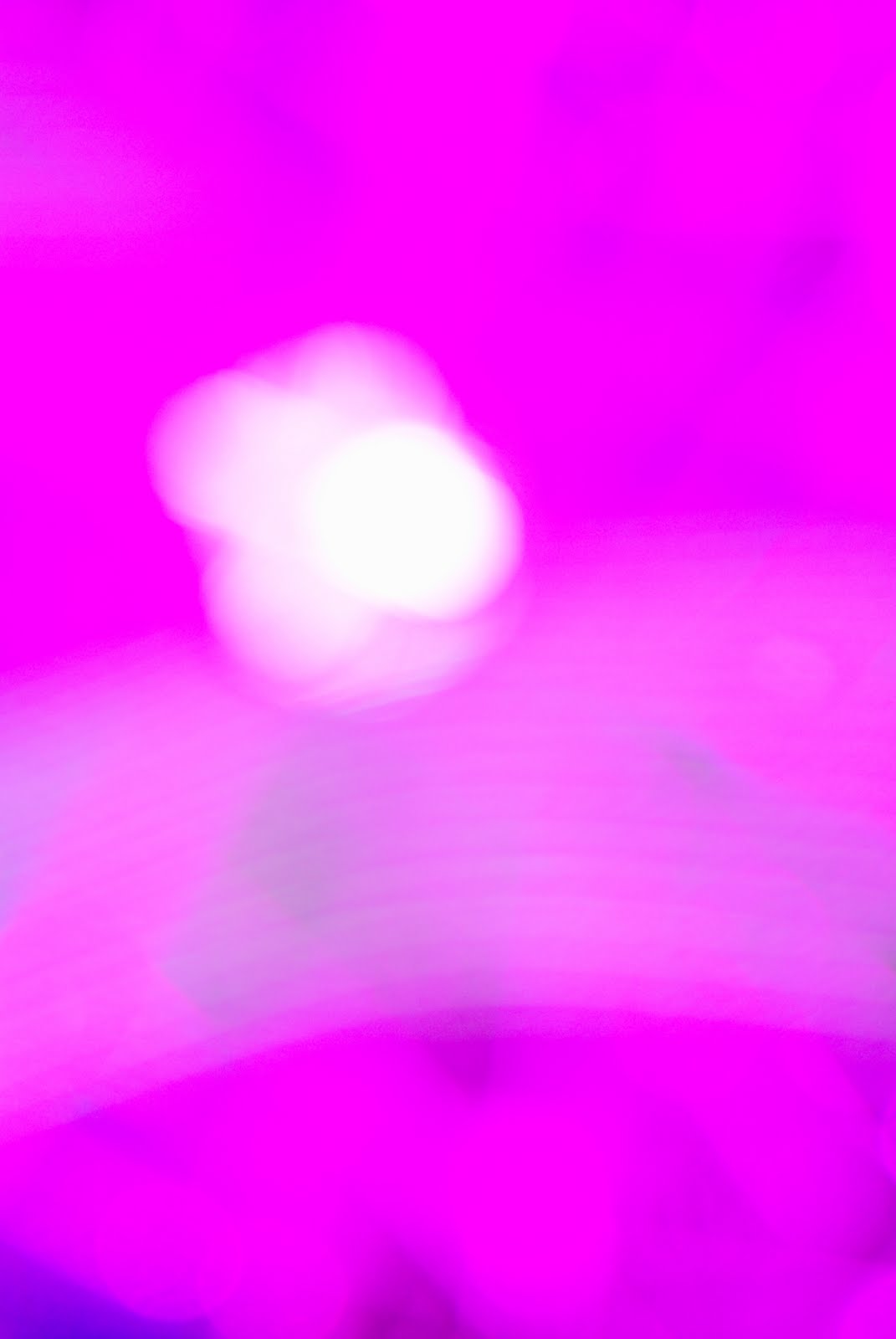
Nam June Paiks' psychedelic hut.An interactive light installation which involves the viewers lying underneath a tall tent,so that you can see up the entirity of the tent, in whcih linial and circular lights move up and down the centre of the shape. The room is under a blanket of low lighting and the lights in all their shades of red,green,yellow and blue both relax and excite the viewers who also begin to communicate with each other during this very interactive expirience. I used the installation to my advantage by taking photographs of the shapes that the light formed to create my own photography work, i managed to get some pretty nice shots..

Liverpool trip 2011: FACT gallery


Back at the beggining of 2011, i went on a group trip to Liverpool. First stop ...FACT. To an exhibtion by one my favourite video/installation artists...Nam june paik....the reason for my attendance. One of the works was an interpretation of the artists style by a group of young people. They managed to create this amazing room of screens,CCTV,LED wires,looped video and interactive sound installations. I enjoy work that directly involves the viewer or makes us question are own insecurities. For example i felt extremely awkward when i was in the rrom as i was aware that my image was being streamed to a large screen outside the room despite the fact that i know i am filmed by CCTV everyday and i barely even notice.


Timeline exhibition: LINK gallery: Manchester


My contribution: 'I heard a man die'
I particularly like the mirror installed by my friend to suggest the present in 2011 and how you can never really capture the now. The future: I attached a acetate copy of an image of victims of war to suggest that man will be the reason for his slow demise.
Timeline exhibiton>
In the Art school we were given the opportunity to be involved in an exhibition,which involved us simply choosing a year between approximately 1970-onwards as far into the future as we desired. I wanted to create a poster due to my current project but as i was aware that an image was preferred i decided to use a recent event that effected me and use black,bold, illustrated text against a white background to attract the viewers. The event was based on an incident that happened outside my flat in which a man was knocked over and killed. It effected me because i heard the impact and the crying screams of his family and it really made me think about how people react to other people grief. I kept the work simplistic in design and to the point. I enjoyed being part of such open an interestingly individual yet fluent timeline.

The Great Glastonbury walk!


My current boyfriend and his best friend are planning an event to take place in June 2011,during which festival goers will walk from Manchester to Glastonbury festival and then attend the festival. They are hoping to also make each stop in different cities an event/mini festival experience in itself .They are very keen on incorporating photography and sculpture/installation, artists,musicians and performers. I have been appointed as "head of art" and we are currently in the process of making the experience a reality. However, i am simply the artist! So..they asked me to take a series of photographs (my first task), out of which another artist would use one or two to create an illustrated poster. So this is one of the first poster drafts with a few of the original photographs. This will be a series of posters and we are hoping to follow this by creating ironic outdoor/indoor sets to communicate the outdoors festival 'vibe' and these photographs would be much more humorous and ironic to capture interest.
I enjoyed this task,despite its simplicity and very restricting brief ( which i am not used to in regards to portrait photography,) as i was able to work to a brief that forced me to think less about the photographic output and more about how the poster designer could use the images. Therefore i was able to use my knowledge of poster art, illustration and photography.


Monday 14 March 2011

Northern quarter graffiti 2

A reflection in symmetry with the background in a dirty puddle. The reflection almost created a poster on the top of this graffiti covered rectangular structure. Un-intentional graffiti.
Framing the city like a poster. The four fans and the dark door area create a Schwitters style collage appearance....(or is that just me?hmm)

i was intrigued by the idea of graffiti versus rubbish. What would you rather see.....rubbish bags like this or graffiti? What is the difference in the eye of the law?

I was thinking of re-wording this sign so that it reads: perverted traffic.


Buses always sit here to talk about their day.


Northern quarter graffiti 1


Sunday 13 March 2011

Northern quarter graffiti : Dan Witz.


I took a few snaps yesterday in Manchesters' northern quarter,there's an area just off Oldham street that i always walk through and i wanted to capture the graffiti and sticker art to inspire my non-developing poster art project. I recently read a book about sticker art and hadn't seen any in Manchester yet,so i began a hunt. Sticker art is usually quite small but it can also be large and eye-cathcing,particualr in built up areas of America.. i managed to find some and it has inspired me even more to make my own. The images of this will be included in my next post. For those of you who may not be sure what sticker art is, it quicker and usually smaller alternative to the illegal fly poster style of graffiti. One of my favourite street artists that tested this method in the earlier days of the medium is Dan Witz. His more recent works continue to use contemporary ideas,such as a 'mosh pit' and creates these paintings of people seemingly going about their everyday business but uncomfortably close..he uses the impact of the urban jungle to increase the impact of his work.His latest street art work follows the theme of grills and barred/glass windows,which Witz has re-created using mixed media and inserted often upsetting scenes,religious and frightening, he them pastes these on doors or walls in public spaces. The craftsmanship of the work is extremely high and takes fly posters to a WHOLE new level. If i saw one of the grids on a wall with a face slowly appearing out of the dark ..i think i would have a heart attack! One of my favourite of his works,is the hummingbird,which he used in 1995. It contrasts so beautifully with the harshness of the decaying, dirty red wall.

The more i look at his work, i realise that he not only a renegade street artist but an amazingly talented photo-realist painter and his street art pushes the boundaries of environmental art/installation using the urban landscape and traditional painting.


Tuesday 8 March 2011

The adventures of Darius and Downey. . .


My most recent book find.


Darius and Downey are street artists that are the main focus of a book i recently bought at the 'CUBE' gallery,manchester. The artists use satire and public space in built up,popular commuter areas to question our everday,subscripted surroundings and also how we view the very nature of art practise. I think of this as alternative poster art, it conveys a ,message and intention to the public in the urban area... but not a conventional message. I love how it can be as random,non-scensical and philosophical as you like,as i am not really a graphics student,i'm fine arty through and through and i find it difficulat to advertise. Darius and Downey intrigued me because they change the shapes and usefullness of usually un-noticed public objects ,such as, signs,bins, symbols and crossing aids. One of my favourite works is a pelican crossing on which they have bent the lights in towards each toher and on another split one down the middle. I'm not quite sure how they do what they do without being caught...unless they have permission???


I'd like to use these principles but start on a smaller scale, as RANDOM CRAB ( my collaboration with Karol.) We plan to use the city as a canvas for some small scale projects. We also hope to continue this project through summer,hopefully this would be become a side project.


Tuesday 1 March 2011

Recent photography work


My plan was to explore an eyecatching portrait that could be used as a poster with or without words. I also wanted to construct poses that i could definatley illustrate into,e.g,framed to allow illustrated areas. The outcome was 3 photos using water + editing that looked quite lovely,i decided not to illustrate into these. I will use the non-water photos as foundations to built onto through hand-made tachiniques. Soon i hope to move onto poster art using objects..like 3d collage on the streets. I want to have an array of different forms by May......:/


Studio+ willing friend+ washing up bowl of water.